Earlier this week, I spoke at OpenVisConf, about how systems thinking and simulations can CHANGE THE WORLD!!! or summin' like that. I'm happy that my talk was relatively early in the conference, so once I was done with it, I could relax and actually pay attention to the other talks.
Like I did for the systems thinking workshop I went to two weeks ago, I thought I'd share the sketchy-notes I took from this conference!
Here goes. My sketchy notes of 17(!) talks from...
![]()
DAY ONE
I skipped the early morning talks on the first day, because I wanted to add some last-minute changes to my talk. (And I skipped the early talks on the second day coz... uh, I slept in.) The following talk summary-notes will be in chronological order, and each sketch will contain the speaker's name, plus the mental image that their talk lodged into my mind.
Anyway, the first talk I saw was the one right before mine:

Mariko's talk was a tutorial on using the <canvas> element. I already have a lot of experience with <canvas>, but I've never seen it explained in such an accessible and adorable way!
For example, to explain image filters, Mariko asked us to imagine a neighborhood of pixels. (as pictured above)
A "blur" filter would be when a pixel likes its neighbors, and wants to be more like them. So, it looks at the colors of itself and its neighbors, and takes on the average color. All pixels do this simultaneously, blurring the image. (And for the reverse, a "sharpen" filter would be when a pixel hates its neighbors, and wants to be less like them.)
This was both a cute and effective way of teaching a pretty technical concept! Vi & I also discovered the effectiveness of "anthropomorphizing" when we made Parable of the Polygons. After all, people think in people.
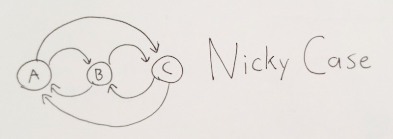
This one's my talk, about systems & simulations! The picture above shows what I think is the core of systems thinking: that cause-and-effect isn't linear, it's LOOPY. Feedback loops, vicious & virtuous cycles, etc.
And from there, I talk about how systems thinking can make us more empathetic and empowered, maybe.
Here's the full pics & text version of my talk!
This was one of the more philosophical and theory-heavy talks at OpenVisConf, but I think I balanced it out with some good practical tips and tools for simulations & systems modeling. Peeps seemed to like my talk. In any case, I'm honored to have been invited to speak there, and okay I'll shut up and stop tooting my own horn now.

Amelia's talk was titled, “Do you know Nothing when you see it?” and that pretty much captures her talk – when we see data, how can we make it obvious if it's statistically significant, or just random noise?
She demonstrated a pretty brilliant idea, and described it like this: a police line-up of graphs.
What you do is have twenty graphs displayed in a line-up. (or, if you wanna get Tufte-y, a "small multiple") Why twenty? Coz p < 0.05 is statistical significance. So one of these graphs will contain your real data, and the other 19 will be randomly resampled data. Then, your job is to try to pick your own data out of a lineup. If you can, congrats, it's probably not noise. If you can't, too bad so sad.
Statistics is a field with so many real-life applications, but my god, the equations are all eldritch abominations. I love these kind of visual/simulation approaches to statistics, because they make stats intuitive.
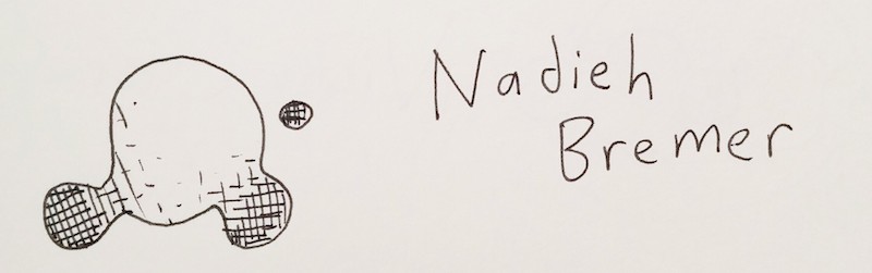
This was the most visually stunning talk. It was a tutorial on how to use SVG gradients. Not very technically difficult, but Nadieh's work showed how you could use them to both add information and aesthetic charm.
The picture above is my attempt at a crosshatch gradient. Whatever.
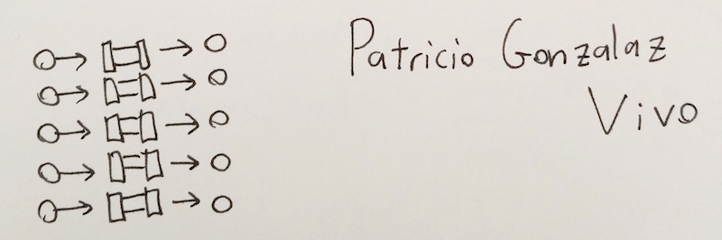
A nice high-level explainer of how WebGL shaders and the GPU work! The picture above is how Patricio visualized the big difference between the CPU and the GPU. A CPU is like one very big pipe – it can do large calculations, but only one at a time. The GPU is like lots of tiny pipes side-by-side – it can only do small calculations, but can do thousands of 'em in parallel.
Here's something I didn't appreciate until I watched Patricio's talk – let's say you want to draw N circles onto a screen. If you were to draw one circle after another, like with the 2d <canvas>, the time it'd take would increase linearly with N. But because the GPU does all the calculations for each pixel individually, it makes no difference between drawing one circle, ten circles, ten thousand circles, etc.
And that ability to render lots of things at once, is crucial for visualizing a large number of data points. (There's the tie-in to dataviz!)

This talk's all about periodic data! There was a lot here, but I'll relay the one big counterintuitive takeaway I got from this talk:
MONTHS SUCK
Or rather, trying to analyze data "by month" sucks, even though it's one of the more common ways to get aggregate data.
But consider this example Zan gave: let's say you run a small restaurant. In this toy example, you make exactly $500/day on weekdays, and exactly $2000/day on weekends. This is the most periodic data you could possibly get. And it'll look periodic, if you analyze it by day, or by week.
But by month? Well. Because the number of days each month isn't always evenly divisible by 7, some months will, by random chance, have more weekends or weekdays than another month. So if you were to analyze your small restaurant's earnings by month, it would look completely noisy. Even though the underlying data is perfectly periodic.
[mind blown]
So yeah, unless you're dealing with inherently monthly data, (like a landlord collecting rent) don't analyze it per-month.
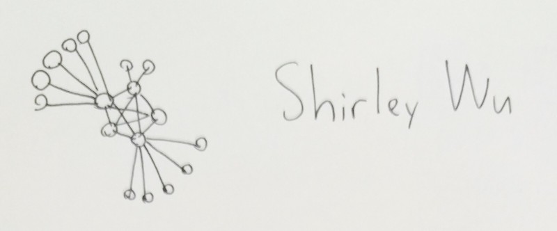
In this talk, Shirley goes through the trials and tribulations of creating visualizations for enterprise software.
One big takeaway I got, was a lesson I'd just learnt two weeks before while trying to make a visualization for PBS Frontline on ISIS's networks. And that is that force-directed graphs (pictured above) are actually really disappointing.
At first you think, wow, this'll automatically generate good-looking graphs for me, cluster the relevant nodes together, and put the most central players in the center! And above all that, they're fun and spring-y!
And then it turns out they make a mess with pretty much any real-world data.
You can't automate insight. Alas.

I'm really glad there was another high-level philosophical talk at OpenVisConf so I didn't stick out. Besides, Tony's talk was really, really insightful!
The picture above is how Tony visually described the core act of communication. We do not simply "transmit" information from one brain to another. We have to help the other person reconstruct it for themselves – but we have limited attention, limited cognitive power, and limited ways of communicating (voice, drawings, flailing hands in the air wildly).
This, by the way, is the epistemological/educational philosophy called constructivism and/or constructionism. ("knowledge ain't transmitted, it's constructed") It's something I've geeked out about before, uh, a lot.
Anyway, if we have limited attention and communication channels, how do you get a reader to "successfully" re-construct an idea you want them to have?
Tony likened it to Lego instruction books. You don't just dump all the pieces on the floor and say "now make the thing". Instead, you...
- show them what they're gonna make
- give them the pieces step by step, one at a time
- have them build the "sub-modules" of the grand thing
- put the "sub-modules" together
- ta-dah
General goal, then piece by piece, submodule by submodule.
As a more concrete example, Tony showed how this applied to one of his more popular works, A Visual Introduction to Machine Learning:
- show an overview of what they'll learn. (with fancy visual)
- give a concrete example, their first lego brick. in this case, SF & NY housing prices
- go through each step of each sub-module of the full idea. (data, dimensions, decision trees, etc) also, transitioning between ideas with literal animated transitions.
- put 'em all together!
- ta-dah
So if you wanna teach someone something, you can't simply teach them the thing. Not directly. You have to break your idea down into submodules, then break those submodules into individual Lego bricks – stories, visuals, direct experiences. This will be hard. Because if you're already really familiar with an idea, it'll already seem to you like a single, unbreakable Lego brick.
But you gotta break it down. And build it back up again.
Finally, Tony concluded his talk – and concluded Day One of OpenVisConf – with how not to teach people things:

DAY TWO
I slept in and missed the first two talks OH WELL. I eventually arrived in time for this talk, summarizing the academic literature in visualization:
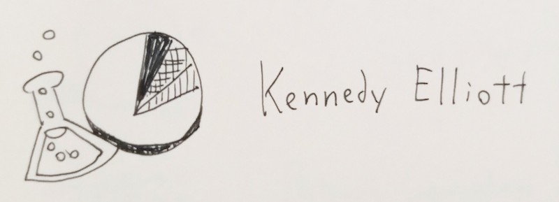
The title of the talk was "37 Studies in 30 Minutes", so, this was a really quick-paced and jam-packed presentation. Honestly, I can't even read my notes anymore. They're just panicked scribbles as I was trying to catch up. I'll wait for the slides to be put up online.
Two takeaways I do remember, though, drawn in the sketch above:
- We can, and should, apply the scientific method to data visualization!
- Apparently pie charts aren't thaaaaaaaat bad. (at least, for showing proportions. For everything else, no. Also never never never ever use a 3D pie chart, what is wrong with you)

Rachel Binx goes through the visualization work she did at NASA, to measure our robots... in SPAAAAAAAAAAAAAAAAAAAAAACE!!!
She pulls a big plot twist and reveals that the work she did at NASA was, quote, "pretty boring". She made mostly standard bar charts and status indicators. But – and here's the takeaway of her talk – that's not a bug, that's a feature. The NASA engineers needed to get their information as quickly and clearly as possible, and any fancy dataviz stuff would just get in the way.
Rachel's talk is a good reminder – throughout all the cool stuff being shown off at this conference – that sometimes, you really don't need all that, and it's best to just get back to the basics.

Wow my sketch header for this talk is pretty abstract.
What it's trying to say is that declarative programming (the brush) is a more creative and freeing way to code than imperative programming (the list). Imperative programming is the standard way we do things, by listing instructions step by step, saying how you want a thing to be made. Declarative programming is just saying what thing you want.
Declarative: Spreadsheets, CSS, HTML
Imperative: JavaScript
And that's the core of (the first half of) Arvind's talk! It really reminded me a lot of Bret Victor's talk, The Future Of Programming, where he pretends to be in 1973, talking about the promising new programming prototypes around that time, allowing us to declaratively and directly manipulate processes, and how absolutely tragic it would be if we're stuck with an imperative text-based interface for coding 40 years later.
yup
In the second half of his talk, Arvind showed off Vega, a framework for making data visualizations in a declarative manner. Cool demos abound! But in hindsight, it's kind of ironic that this talk about a big brand new framework would come right before this one...

The title of Adam's talk: "Tiny Tools"
Adam goes through a few dozen-line programs he's written for himself, tools which shave off seconds and minutes here and there. It may seem trivial, premature optimization, but Adam says it's not just about saving time – these tools let him code more declaratively, and the shorter the iteration time between coding, and seeing what it does, the more creative you can be. It frees your mind.
(This reminds me of another of Bret Victor's talk, Inventing on Principle.)
Anyway, takeaway: make tiny tools, and open-sauce it for the rest of us, k thx
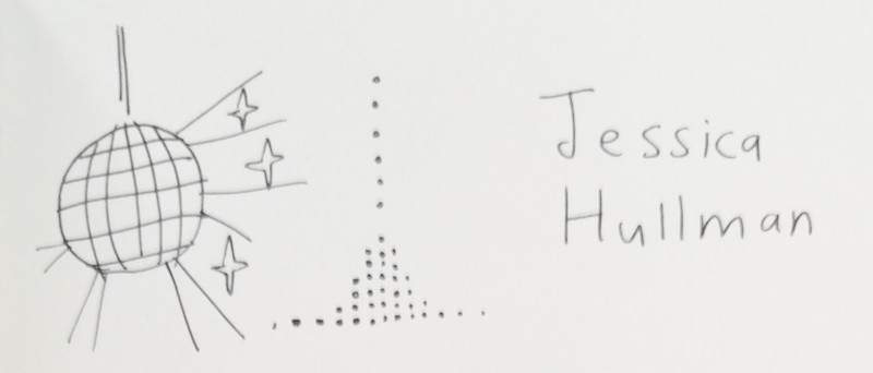
This talk wins the award for Best Extended Metaphor
Jessica's talk is about how to visually communicate uncertainty. She compares the static ways we do it – histograms, violin plots, error bars – are like folk music: old technology, and abstract as hell. In contrast, using simulations (the theme of my talk!) to show that probability is a process, is like disco music: new technology, and a lot more visceral!
So how do you make a good probability-simulation? Two things are needed:
- Show one case happening at a time.
- Build the aggregate distribution step-by-step.
Concrete → Abstract.
Good examples of this form of probability-simulation include Nathan Yau's Years You have Left To Live Probably, Maarten Lambrecht's Rock n' Poll., and Victor Powell's explainer of the Monty Hall paradox.
Now that I'm writing up all these notes back-to-back, I'm noticing this fits perfectly into Tony Chu's framework for teaching things: concrete bricks, one at a time, that build up to the main idea.
(I'm also noticing this talk picks up on a theme Amelia used in her talk, Do You Know Nothing When You See It – and that theme is that statistical resampling & simulation is goddamn magic.)
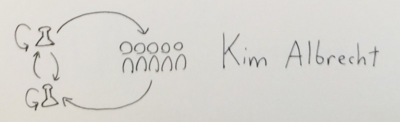
Like Amelia's talk, this one's less about using visualization to communicate to an audience, but using visualization internally, for and between scientists to figure out what to communicate in the first place!
The above sketch-drawing is Kim showing how visualization can be used by a solitary scientist to find insight, or used to aid collaboration between scientists of different fields, or, of course, to present their findings to a general audience.
Kim gave me a lil' shoutout, saying "See, visualization is LOOPY!"
thanks Kim :3
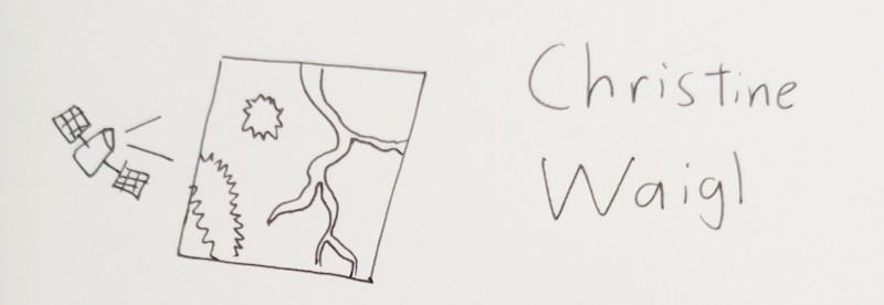
Another talk about SPAAAAAAAAAAAAAAAAACE!!!
Other than lots of cool pictures from space, (and by "cool" I mean "depressing", because half of them showed retreating glaciers, flooded cities, forest fires, and other horrid effects of climate change, oh well) Christine posed a pretty good question to the dataviz community: why don't we use more bitmap data? (Most dataviz peeps use vectors, coz they're easier to work with mathematically) After all, there's thousands of free, public domain space satellite images to work from, which tell really powerful stories.
(I note, looking at these talks back-to-back, that the first talk I saw about <canvas>, from Mariko, might have some specific tips on how to analyze that bitmap data from SPAAAAACE!!!)
The introduction to this talk refuted the introduction to my talk.
fack.
At the beginning of my talk, I claimed that more information was making us less informed, because now there's too much haystack, not enough needle. We're getting constant updates on surface-level events, but few people are investigating the deep, underlying systems of the world.
Chris's talk starts off with a long, long list of people in history (including famous media theorist, Marshall McLuhan) making the same claim – that the more information we have, the less we'll be able to filter out all the crap.
The mistake I now realize I made, is thinking it's linear, not loopy. The amount of data may be increasing exponentially, but so will our ability to sort through them. It's an arms race between crap and the crap-filters. (I feel better knowing that very smart people like McLuhan made the same mistake, though. And actually, maybe people who raise alarms about this might be necessary to motivate people to make better filtering processes. Maybe it all works out. Or maybe, like all arms races in the past, it'll still end badly.)
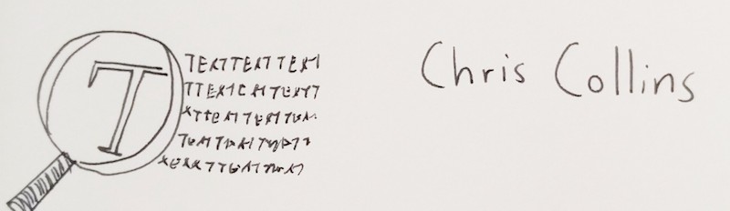
Anyway, Chris's talk was about text analysis, scraping through everything from tweets to legal documents to leaked passwords, to find interesting patterns and stories! Chris self-awarely notes that text analysis is limited, and looking at a word cloud of Shakespeare is not the same as reading Shakespeare.
T h e F i n a l T a l k .
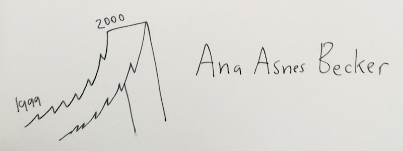
Ana spends this last hour showing off some cool videos of data visualizations in VR! The one that stuck with me the most is the one I crappily drew above: the NASDAQ stock prices, before and after the 2000 dotcom bust, as a VR ROLLERCOASTER EXPERIENCE.
It uses the affordances of the VR medium – a visceral sense of scale, our fear of heights, motion through a space – to communicate how exciting the moments leading up the boom were, and how steep the drop right afterwards was.
Now, Ana admits that VR faces a lot of challenges – how do you interact with no hands, text is hard to read in VR, it causes nausea in a lot of people, etc – but maybe these unique affordances of VR could lend itself to some visceral gut-punch visualizations.
Ana concludes her talk, and thus concludes the conference, with a video of her (adorable!) granny trying VR for the first time, on a Google Cardboard. She's playing through the Boom-Bust Rollercoaster. And when it plays, her granny says in the sweetest voice:
“oh, that's marvelous!”
And that's it! That's the end of the conference! And the sketch-notes for the 17 talks I went to, gosh, wish I could've seen the four morning talks I missed. Oh well.
Hopefully these notes of mine could help you, and weren't too rambly! I think this compilation also helped me see some recurring themes, some connections between the talks I missed the first time.
And so, a meta-summary of my summaries:
- Concrete → Abstract
- Break it down, then build it back up.
- Statistical simulations are frikkin' magic.
- Teach by example, and by metaphor.
- SPAAAAAAAAAAAAAAACE
Thanks again to OpenVisConf for the opportunity to speak here!
![]()
<3,
~ Nicky Case