Ten months ago, I had the idea to do some interactive thing involving Hebb's Rule & neurons. Since then, I've been sketching/prototyping several different versions. The final version I released, Neurotic Neurons, took only four weeks from start to finish, and that's including one week off for XOXO.
So, that's nine months of mucking about, then one month of actually useful work. The 90% crap rule holds up.
Anyway, the upside of having created and playtested so many different versions, is that I can compare and contrast them. With the feedback of dozens of playtesters, I now have semi-sorta-kinda-not-really-empirical evidence of what does and doesn't work for an interactive explanation.
Here's what works. This is kind of a note to self, so next time, I can avoid nine months of mucking about.
1. Huge possibility space.
Before Neurotic Neurons, my neurons project looked like this:
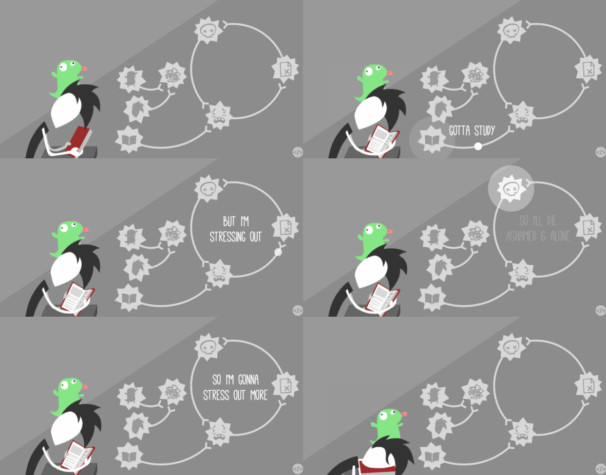
It definitely had more story and art, but there were only there things you could actually interact with. As my playtesters reported, it didn't feel like a system, it felt like an obtuse animation.
Neurotic Neurons took the complete opposite approach:
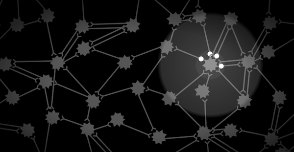
When it starts off, you get 30-ish neurons you can click in any order you want, whenever you want, even while the narrator is talking. Even in the therapy scene:
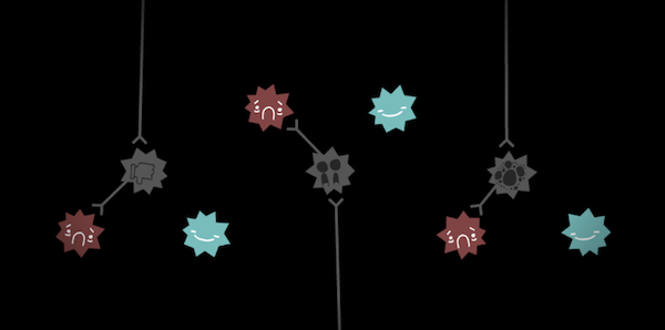
There's still nine neurons you can click in any order you want. What I could have done was force the player to go through each set of three in sequence, but limiting it down to three options would feel like -- as reported before -- an obtuse animation. Ironically, most players solved the therapy puzzle sequentially from left-to-right anyway.
There's another major difference Neurotic Neurons took from my previous version...
2. Direct manipulation.
As you saw in the first GIF above, you'd click the book, then my character reads it, then some magic signal flies off, then it fires the neuron. That's three in-betweens.
In Neurotic Neurons, you click to fire a neuron. Not even one in-between. The manipulation is direct.
There's not much to say about the virtues of direct manipulation, other than it gives better control, or at least a better illusion of control, and besides, it just feels good, which brings me to my next point...
3. Juice! Juice! Juice!
When you first click on a neuron, it just sends so many signals out flying, creating lots of interesting visuals from one or a few interactions. That's what game designers call juicy -- things that squish & squash & bounce & brighten & react to whatever you do.
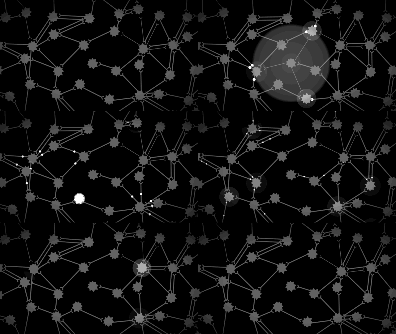
Feels good, man.
(In an early prototype of Neurons, the neural network was randomly generated, meaning some neurons would have no outbound connections, so they were boring to click. So that's why in the released iteration, I manually created a neural network so that any neuron you'd click on your first go would be juicy and interesting.)
On top of the visual juice, one unique aspect of Neurons was the voice juice.
I, the narrator, would react to little things you do, too! (Inspired by The Stanley Parable and Bastion, of course.) If you made little mistakes in the Hebb/Anti-Hebb parts, my narrator would gently guide you. The first time you click a neuron, I say “Yeah!” If you click a neuron before I was done talking in the intro, I'd say “Ex-CUSE me, I'm talking here!”
Why would I let the player interrupt me? Other than being funny, it fits other design pattern I stumbled upon...
4. Low non-interaction.
With the exception of the 8-second intro and 8-second outro, you can always interact with something in Neurotic Neurons. Even during the credits. Even while the narrator is talking.
(For some reason, most of my players decide to patiently wait for me to finish talking, and I'm not sure why. Maybe just the knowledge you could interact if you wanted to is enough.)
This "Always Be Interactive" rule has already made its way to mainstream game design, with games that deliver story through scripted sequences, or disembodied voiceovers. (as opposed to the game-story design philosophy of mixing cutscenes and gameplay, like oil and water.)
However, not all kinds of interaction are good, so...
5. No crap-interaction.
Think back again to the first GIF I showed you, where you have to click to get a piece of the story about my anxieties, and there's no meaningful choice of what to click. That's a crap interaction.
(Aside: There's two exceptions I can think of for when "click-this-to-progress" can work: creating anticipation, like unwrapping a present, or creating panic, like a series of fast quicktime events.)
(Aside II - The Tangentioning: I'll write more about crap-interaction in a future post, but Bret Victor's long-ass essay, Magic Ink, has a particularly eye-opening section titled “Interaction Considered Harmful”. If you have, uh, an hour to spare, I recommend reading it.)
But interaction for the sake of interaction? No. So in my new version, when I deliver the part of my story about my anxieties, the neurons automatically fire. You can still interact with it if you want to, but you no longer have to:
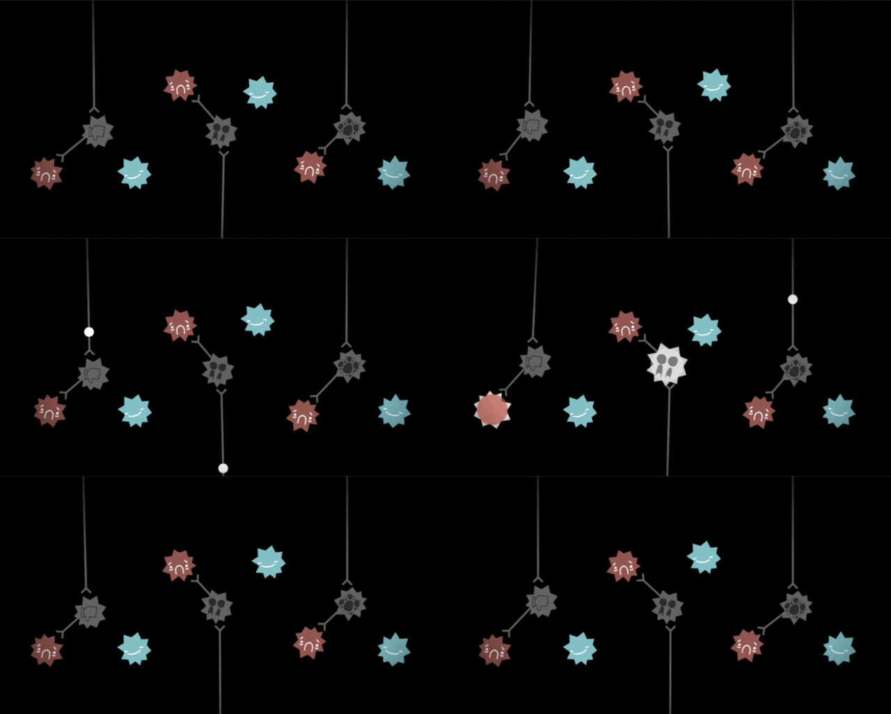
Oh, this scene reminds me. You see that specific arrangement of neurons? I considered other arrangements, but this one was the only one that let me...
6. Keep mechanics consistent.
For comparison, I previously wanted to make the fears hierarchical, like a fear of public speaking connecting to both a fear of social interaction and a fear of failure. However, if the player were to disconnect those connections, the entire thing would make no sense. The only way to prevent that would be to "lock" the connections.
An ugly solution which, actually, in a previous version, I did implement:

It's a sucky solution, so I scrapped my plans for a hierarchical arrangement, and did the three-part arrangement you see in the final version.
However, that arrangement still needed constraints. You shouldn't be able to connect fears to each other, or connect feeling fear to feeling safe. However, this time, I could enforce that constraint through spatial distance! Those neurons would simply be too far apart for Hebb's Rule to work, something I already established before.
The lesson I learnt was, whenever you need to enforce a constraint, try to use the mechanics you already have.
Also, one should try to be consistent with the mechanics throughout. In the introduction to Neurons, I could have disabled Hebb & Anti-Hebb's rule, just to focus on the signal propagation, but I thought it'd feel more elegant to have it consistent throughout.
And besides, in a previous version, I did toggle the rules on-and-off at different points, but that just made it more confusing, less clear, which brings me to my final lesson...
7. Clarity > Cleverness.
Early on, I made a whole bunch of things I thought was just sooooo clever, but just ended up making things more confusing. Here's a few of 'em:
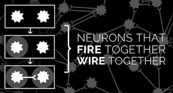
Hebb's Rule has a nice mnemonic rhyme, “Neurons that fire together, wire together.” However, that rhyme doesn't tell you which direction the connection is created. Anti-Hebb's rhyme, “Neurons that fire out of sync, lose their link,” also just confused people.
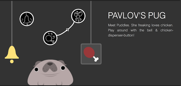
One original premise for my neurons project was to explain the famous conditioning experiments, and see them in a new light! However, since they wouldn't be in “a new light” if you didn't know about them, and if you already knew about them, the puzzles would be boringly easy... so it was all just cleverness for no solid reason.
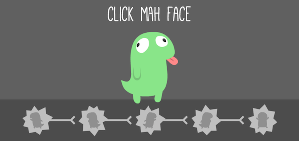
Finally, there's this clever thing, the thing I was most reluctant to kill. Chompy the Lizard Brain. So cute! So loveable! Ended up being a very muddled metaphor that confused everyone, including myself.
(Note: more clarity =/= more exposition. In previous versions, I'd over-explain things, but the more redundant information, the less players paid attention, so the more confused they were later on.)
By the way, as much as I dislike listicles -- such as this blog post -- I will admit it's a very clear format.
In Summary:
- Huge possibility space.
- Direct manipulation.
- Juice! Juice! Juice!
- Low non-interaction.
- No crap-interaction.
- Keep mechanics consistent.
- Clarity > Cleverness.
Here's to less mucking about next time.
